
Field settings
This is the form config page:
1: Main menu
2: Field manager
3: Field settings
4: Form preview

1- Content
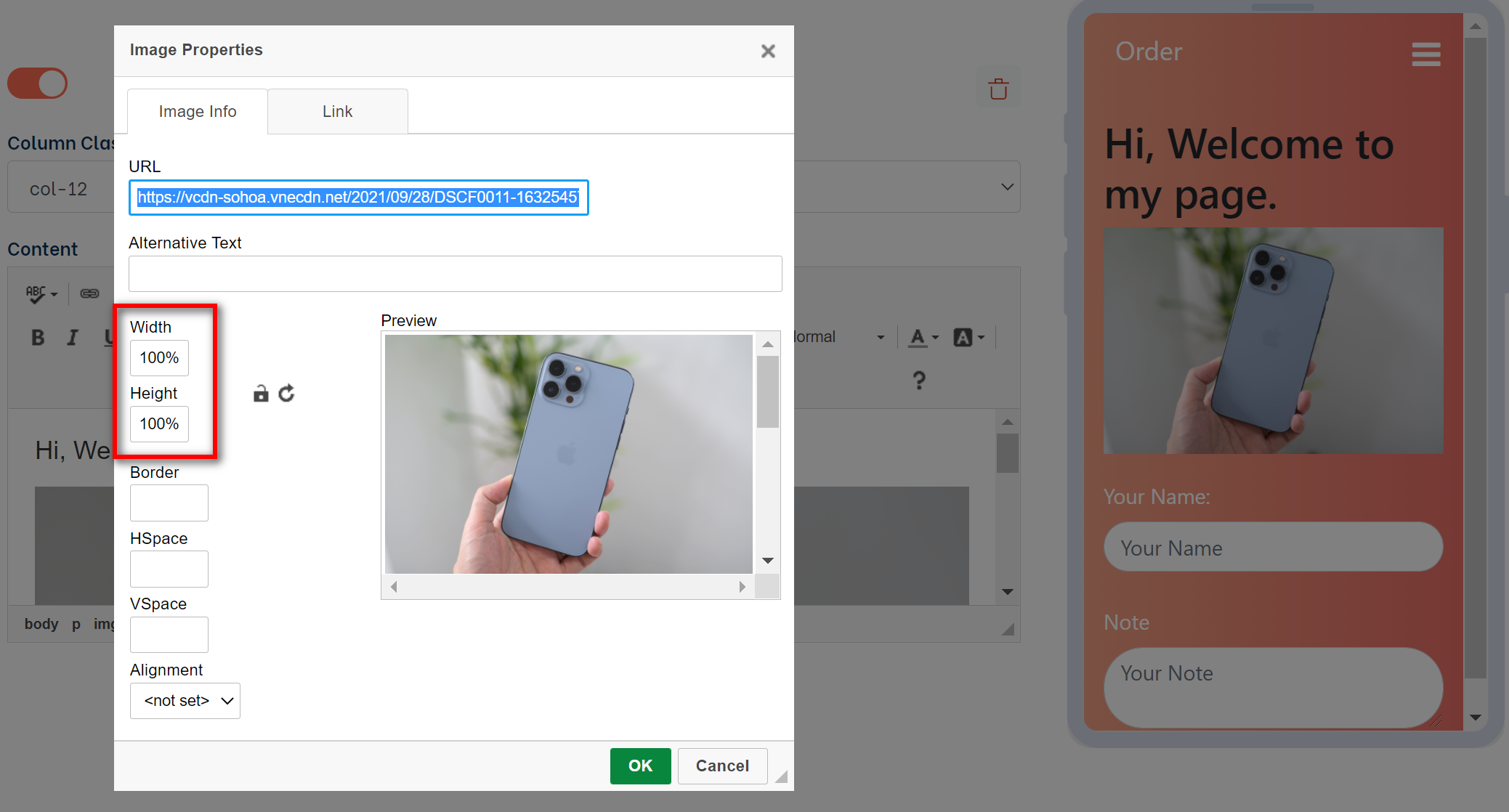
The content field is only for display purposes, not for gathering information. You can put text, pictures, video... in this field
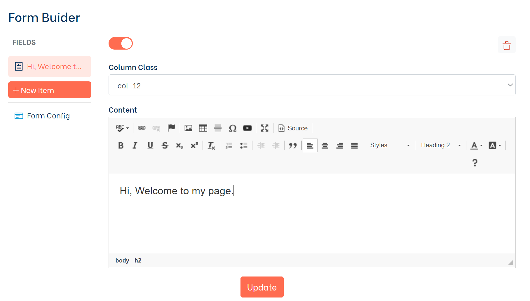
Note: Set the width of your video/image to 100% for responsive display.
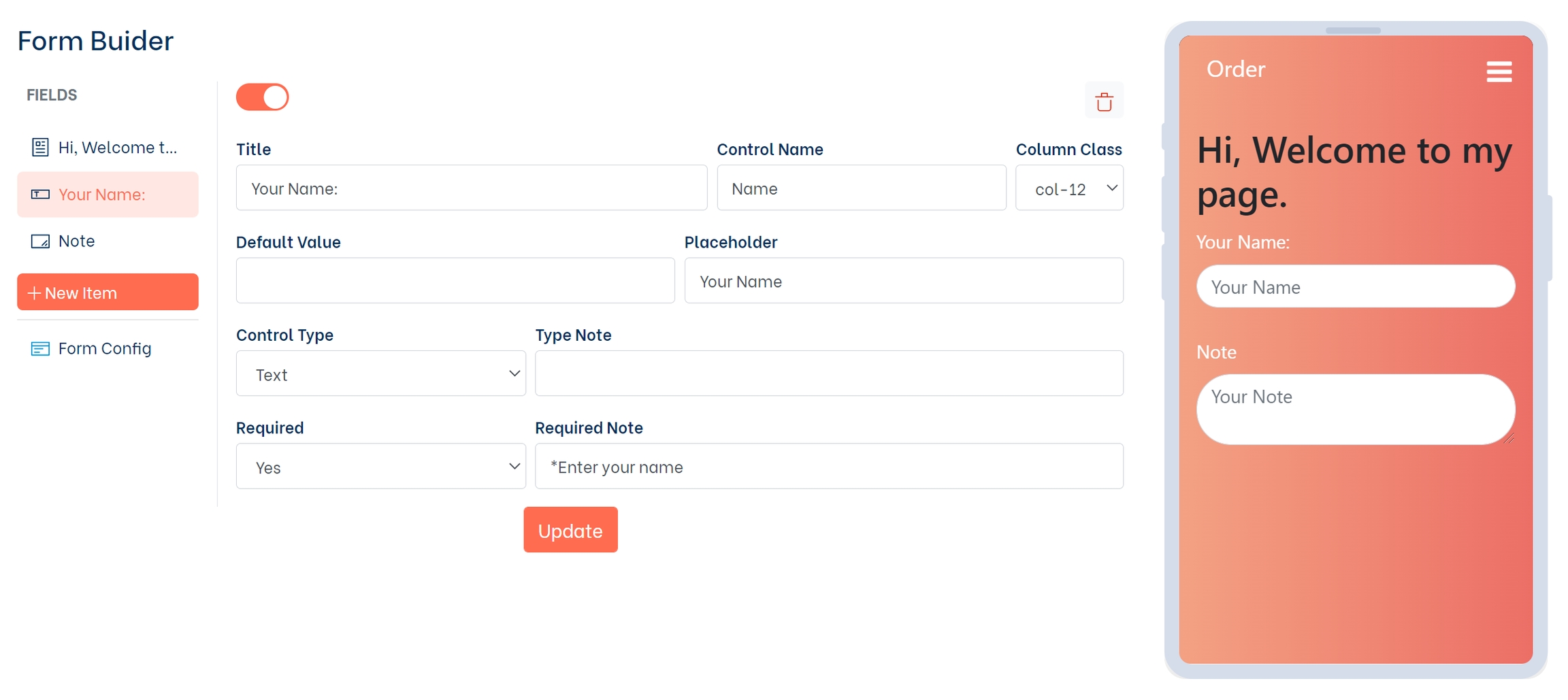
2- Input field
This is the most used field for gathering information:
Title: Field title
Control Name: This is the attribute name for your field value
Default Value: Default field value
Placeholder: Placeholder value
Control Type: Field input type (Text, Number, Email, Url, Password, Hidden...)
Type Note: Error message for wrong type
Required: Optional
Required Note: Error message for required field
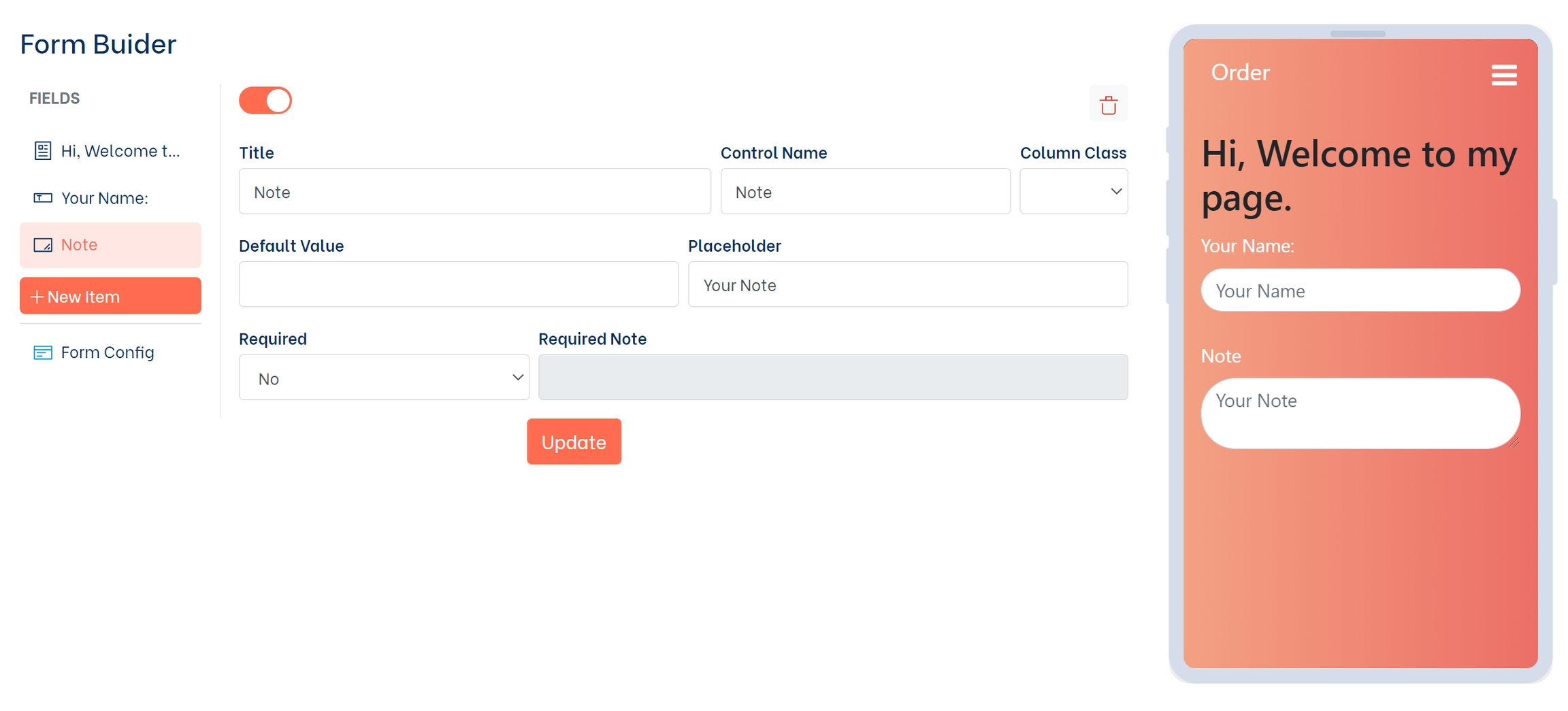
3- Textarea
This field is similar to the input field, but for longer text
Title: Field title
Control Name: This is the attribute name for your field value
Default Value: Default field value
Placeholder: Placeholder value
Required: Optional
Required Note: Error message for required field
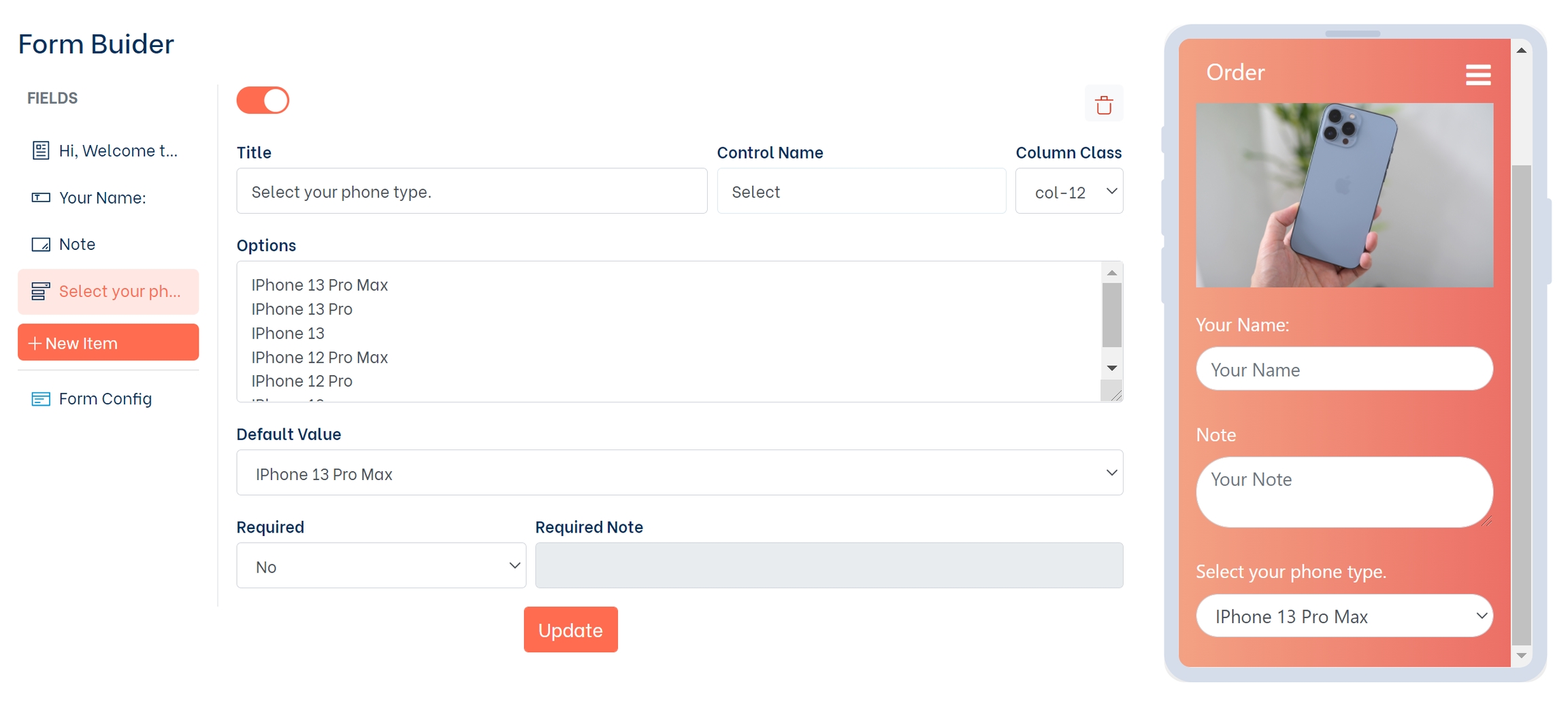
4- Select
This field provides a drop-down list:
Title: Label for your list
Control Name: This is the attribute name for your field value
Options: List of options for the field. Separated by line break
Default Value: Default field value
Required: Optional
Required Note: Error message for required field
Note:
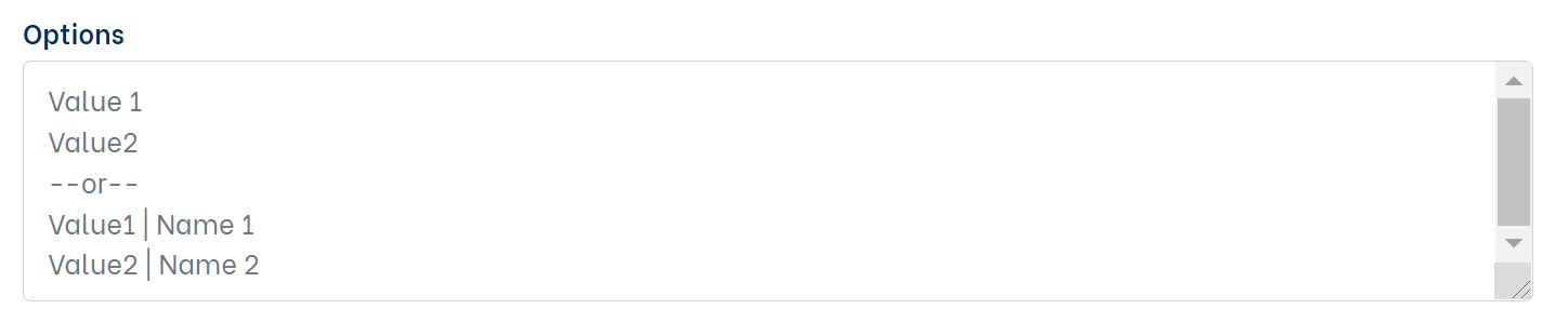
Each option has to be separated by a line break. There are two ways to declare an option:
If you declare your options as (1), your Value1
If you declare your options as (2) using a vertical bar | , your Value1
5- Checkbox
Text: Field title
Control Name: This is the attribute name for your field value
Required: Optional
Required Note: Error message for the required field
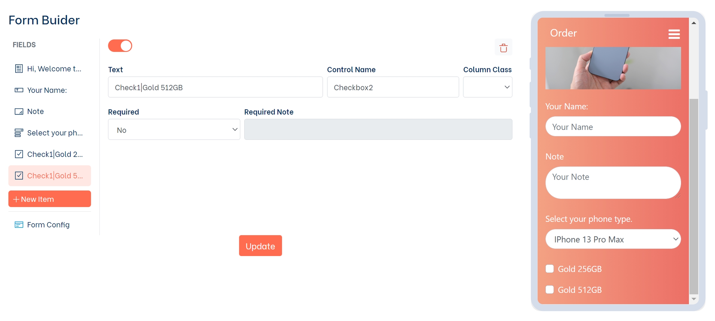
Note: How to enter data in the Text section, there are 2 type: Value and Text (Value | Text)
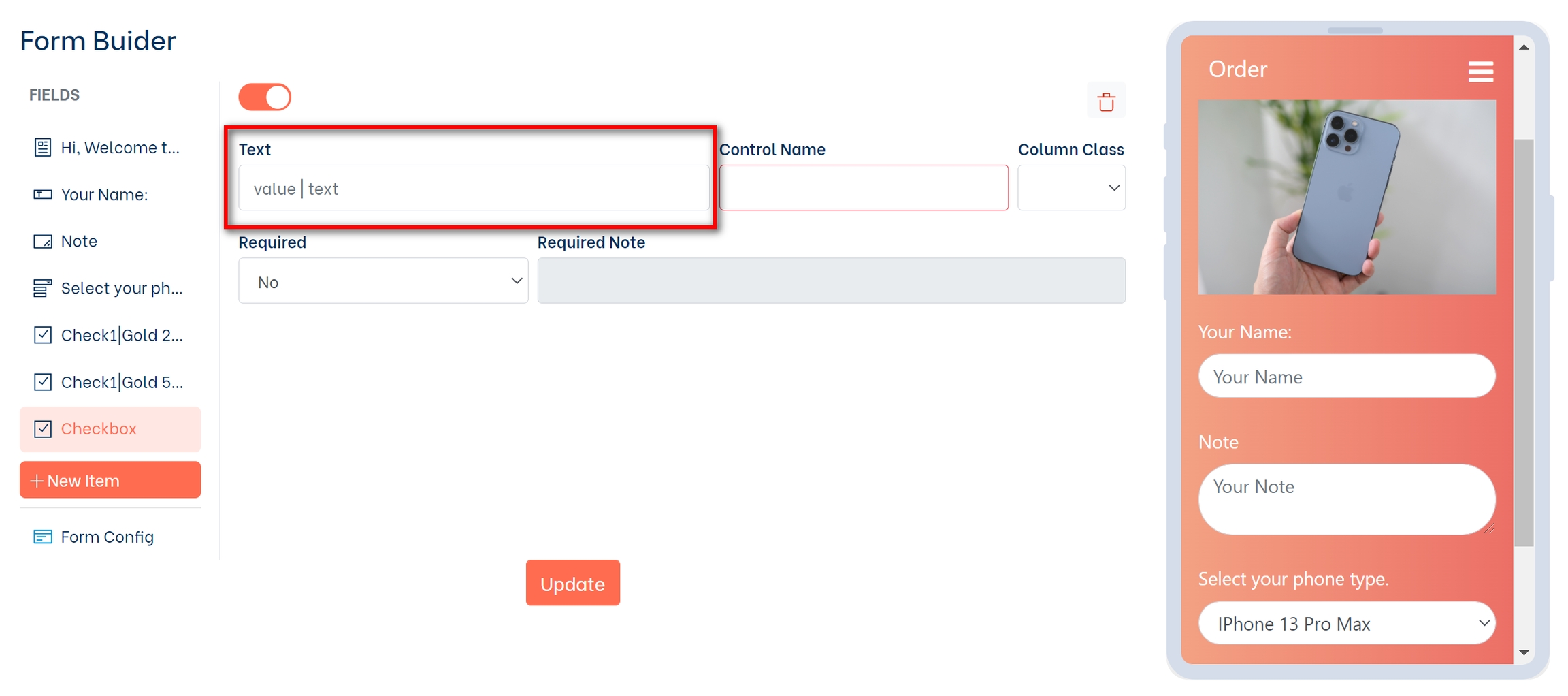
Text: If you enter here only Text, this Text will be displayed on the webview and set to the value for the Control Name.
Value: If you enter here Value| Name, the Name will be used to display on the webview, and the Value will be used to set the value for the Control Name
6- Radio
Control Name: This is the attribute name for your field value
Options: List of options. Separated by line break
Default Value: Default field value
Required: Optional
Required Note: Error message for required field
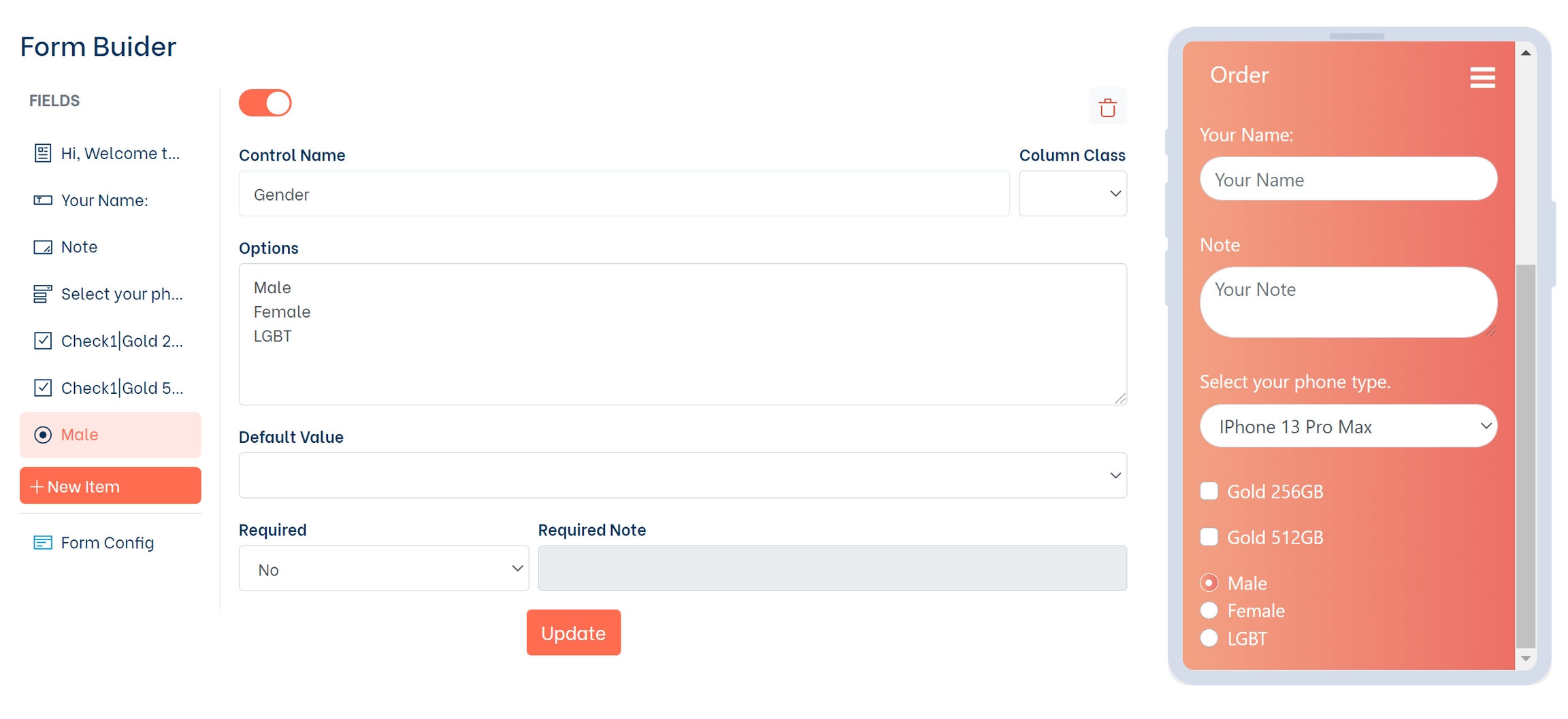
Note: How to enter data in the Text section, there are 2 type: Value and Text (Value | Text)
Text: If you enter here only Text, this Text will be displayed on the webview and set to the value for the Control Name
Value: If you enter here Value| Name, the Name will be used to display on the webview, and the Value will be used to set the value for the Control Name.
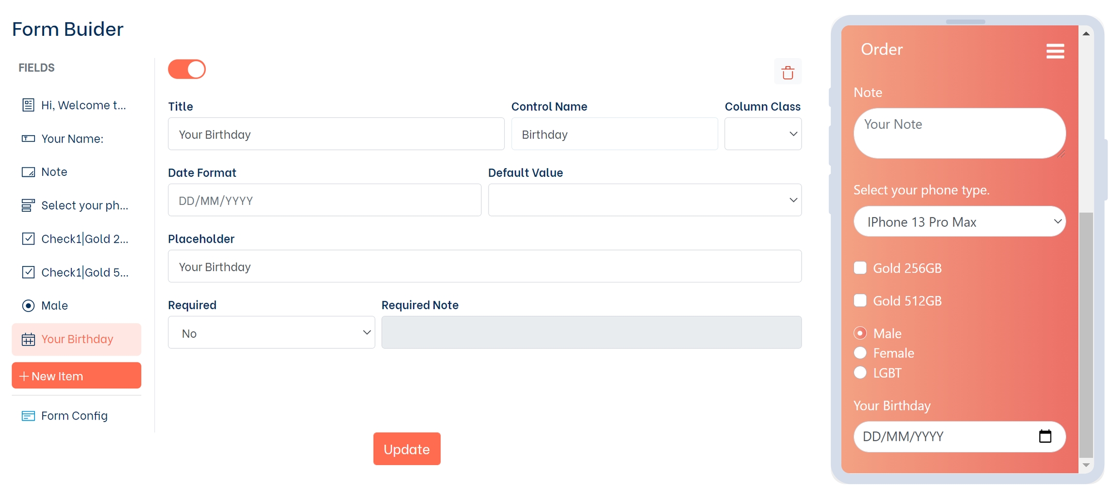
7- Date
Date card is used for customers to choose the time (Day/Month/Year).
Title: Field title
Control Name: This is the attribute name for your field value
Date Format: Ex.: mm/dd/yyyy , dd/mm/yy
Placeholder: Text placeholder
Required: Optional
Required Note: Error message for required field
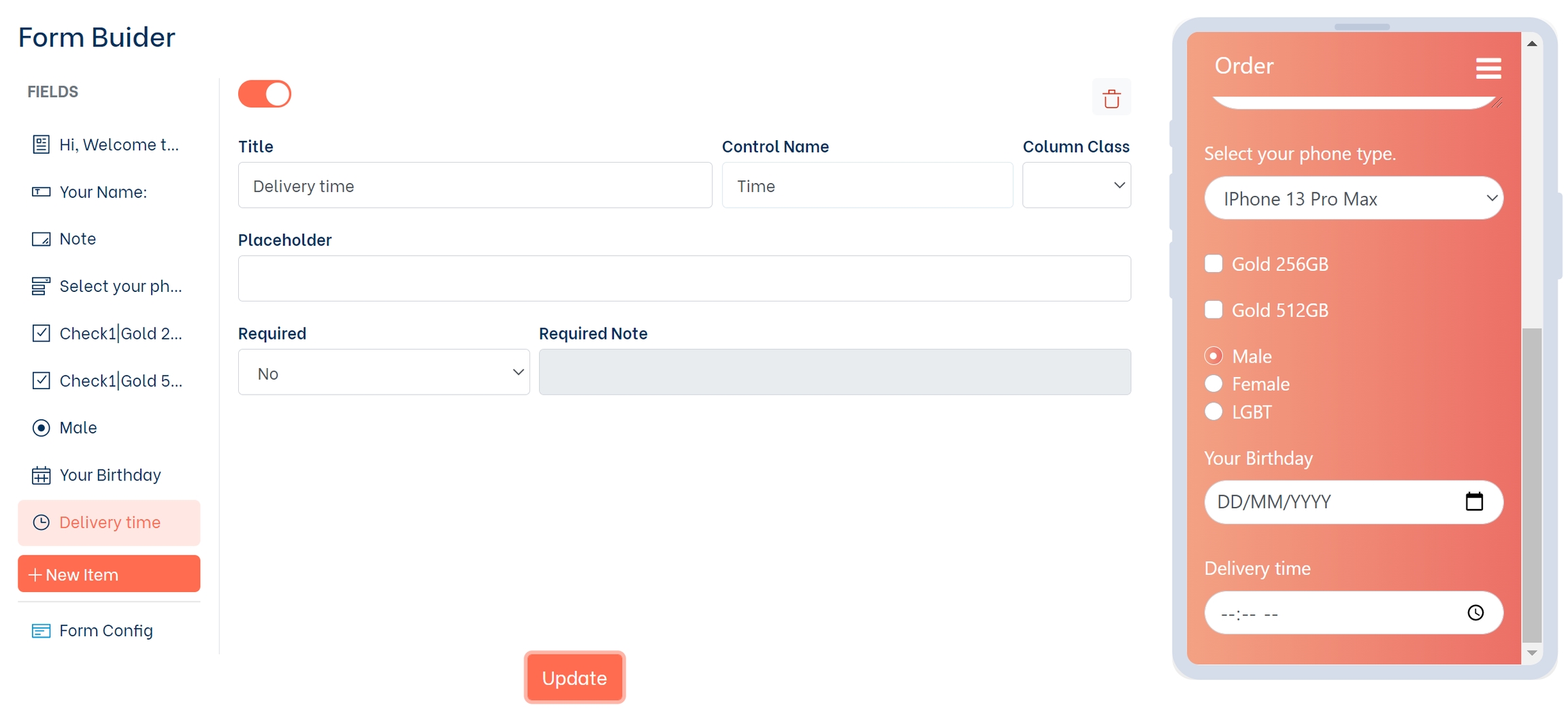
8- Time
Time card is used for customers to fill in time information (hour: minute)
Title: Field title
Control Name: This is the attribute name for your field value
Placeholder: Text placeholder
Required: Optional
Required Note: Error message for required field
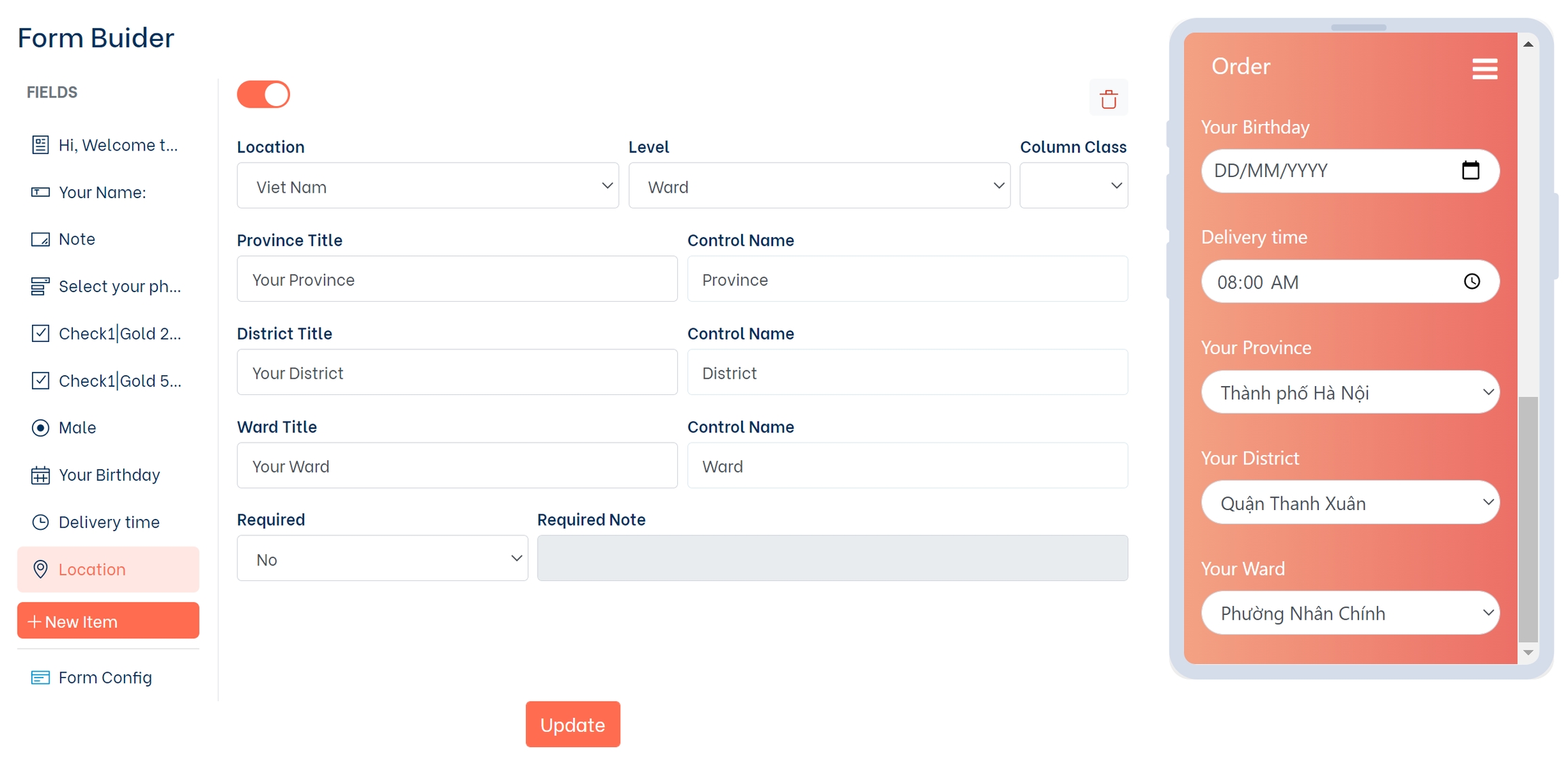
9- Location
The Location card helps you create an administrative boundary field for customers to choose from to help get the customer's address information. Currently, the card only supports borders in Vietnam.
Location: Select your country
Level: Location level selection
Province Title: Title for province field
District Title: Title for district field
Ward Title: Title for ward field
Control Name: This is the attribute name for your field value
Required: Optional
Required Note: Error message for required field
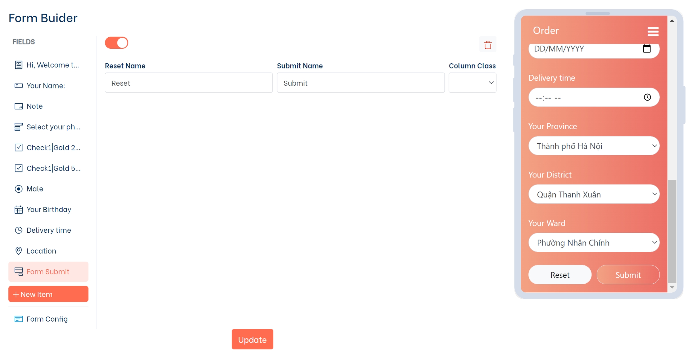
10- Form Submit
The Form Submit card is used to reset and submit the form's information to another platform connected to the push data.
Reset Name: Text inside the reset form button
Submit Name: Text inside the submit form button
Last updated